Data analysis and visualisation for GP synergy.
- Client
- GP Synergy
- Skills
- Data analysis, data visualisation
GP Synergy came to us with a problem. For several years they had been collecting data about the services they had been delivering, however, they were struggling to gain real insight from this information, to demonstrate its effectiveness to others, and identify service gaps to improve on. They needed our help to not only do something more with their data, but to also help bring it to life.
In the first stage, we worked closely with the GP Synergy team to explore the information they had available and identify the key issues and questions that needed answering. It soon became apparent two key questions would drive the analysis:
- Had their initiatives had any effect on the delivery of training services?
- Was the training targeted to the practices, and populations that needed it the most?
To answer these questions, the analysis combined a number of complementary datasets from different sources to place the GP Synergy data into a wider context.
During this exploration phase, we rapidly prototyped several different ways of combining, analysing and visualising the datasets – looking for patterns and trends designed to drive greater insight for the client.
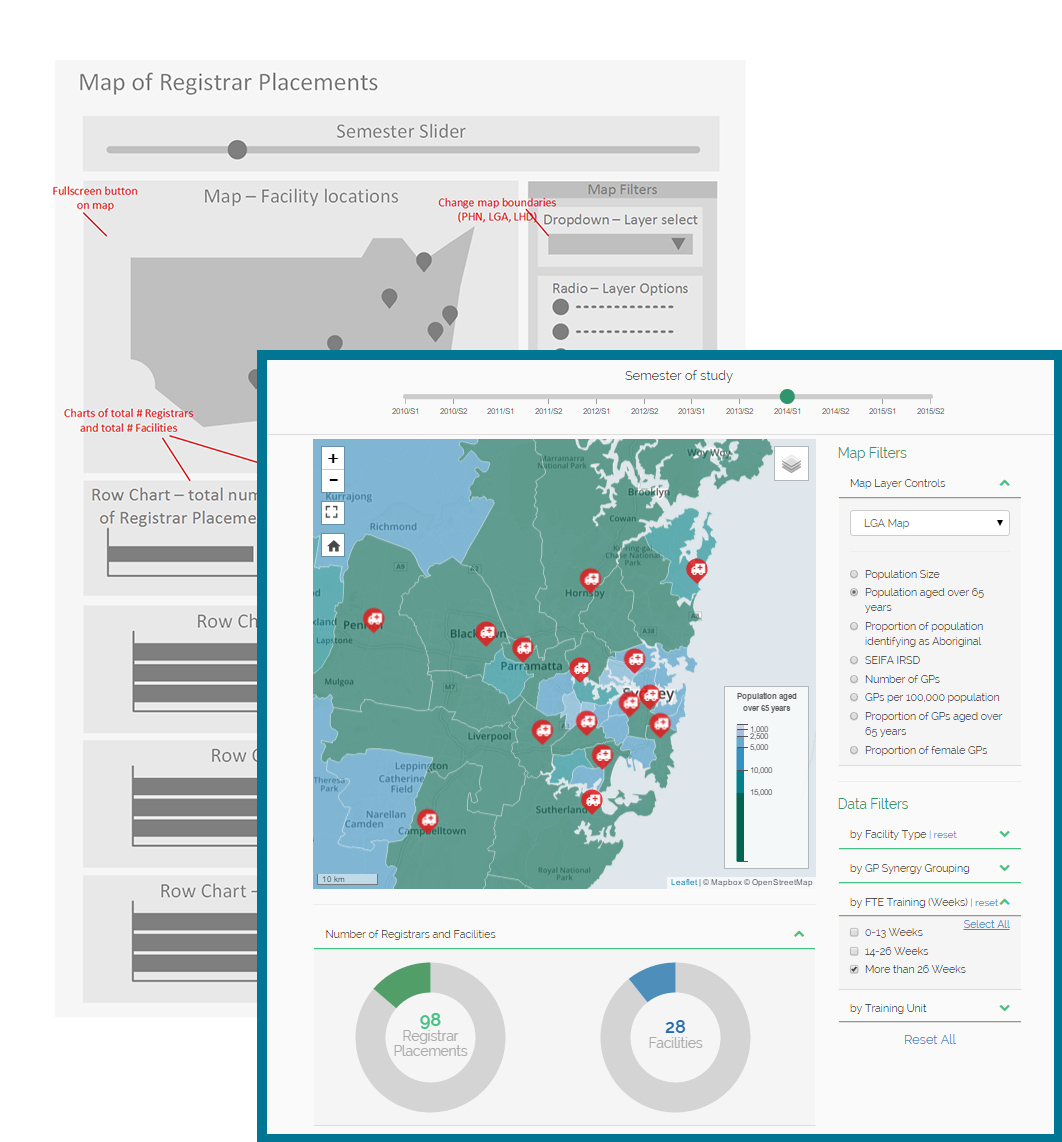
What became clear was that GP Synergy needed to understand the change in their training delivery as well as how that training was distributed geospatially across key populations to ensure its services were delivered effectively.
Key findings from this process communicated the complex and interlinked analysis into a simple, interactive and engaging visualisation. For example, a geospatial map displayed key demographic measures such as population growth, Aboriginal populations, GP workforce numbers and SEIFA/socioeconomic deprivation data. Overlaid over the top of this demographic layer was critical information about the practice locations that were trained by GP Synergy and the type and intensity of training provided.
The page was designed to encourage users to delve deeper into the visualisation to explore specific questions and see how the distribution and types of training provided by the client had changed over time.